
Signmark Solutions
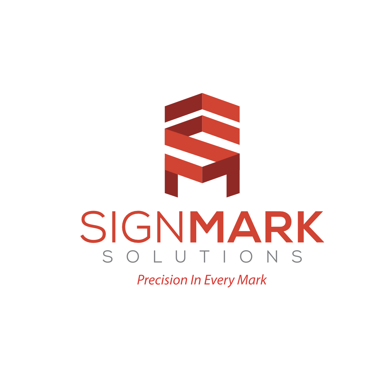
S & M Initials: The logo mark cleverly integrates the initials S and M, representing the brand name. Arrow Element : The upward arrow symbolizes direction and guidance, core to wayfinding design. Isometric Structure : The geometric, three-dimensional form conveys the idea of multi-facial signage systems and the brand's technical craftsmanship. Shield Form : The overall silhouette subtly forms a shield, symbolizing trust, reliability, and strength - values central to the company's identity. Color Palette: The use of bold reds reflects energy, visibility, and confidence, while the grey tone of"SOLUTIONS" adds a sense of professional balance.
Scope : Brochure Design, Visual Identity & Print Production
Client : Signmark Solutions , Ludhiana .
Next Project
UR City Mall - Brochure Design
publication design